Case Study
Patterns of discoverability and clarity:
Elevating search and table experiences
across Jio
Solution
Figma ‘Search’ and ‘Table’ pattern for design re-usability
Role
Design leader/ mentor
Collaborators
1 UX designer (Research and UX), 1 UI designer (UI and interaction), 1 component designer [for each pattern]

Note:
Why bring two distinct patterns into a single case study? Presenting them separately would have resulted in two narratives with almost identical processes and frameworks, differing only in a few unique challenges. By combining them, the story becomes more powerful: it demonstrates how the pattern creation framework translates into practice through two successful, live implementations.
What makes this pairing compelling is their contrast: Search, a high-demand pattern central to B2C experiences, and Table, a core enabler within B2B workflows. Together, they serve as a strong testament to the framework’s versatility, proving its ability to scale seamlessly across very different product contexts and industry needs.
Impact
Search pattern (Data as of Aug 25, 2025)
60+
average monthly pattern inserts
Used consistently across the Jio org’s
Figma ecosystem.
1%
average pattern
break rate
Exceptionally low error incidence, reflecting robust design governance and reliability.
21%
average increase
in conversion rate
Unified search pattern drove an average 21% conversion increase across 5 key Jio products post adoption.
Table pattern (Data as of Aug 25, 2025)
25,000+
average monthly pattern inserts
Used consistently across the Jio org’s Figma ecosystem.
0.03%
average pattern
break rate
Exceptionally low error incidence, reflecting robust design governance and reliability.
34%
faster task
completion
Unified and accessible Table pattern reduced average data-management task completion time by 34% across key B2B products.
Context
The Jio Design System (JDS) - Patterns initiative was envisioned as a strategic evolution to move beyond visual consistency and deliver a truly unified brand and user experience across Jio’s diverse digital ecosystem. While components and blocks help us accelerate visual consistency by grouping common component layouts, patterns help us design at scale by standardising how users move through key tasks and journeys. Components and blocks make the page consistent. Patterns make the experience consistent. At its heart, the mission was clear: drive efficiency for design and development teams while accelerating time-to-market.
So, what exactly are patterns? A pattern, in its simplest form, is a cohesive group of components, orchestrated through user-initiated interactions and state changes, to accomplish a specific, focused task. In any mature ecosystem, certain experiences occur so frequently that reinventing them every time is both inefficient and risky. Search is a perfect example, ubiquitous across nearly every product, yet often implemented in inconsistent ways.
By developing a front-end Search and Table pattern, with flexible backend integration points for product teams; we set out to ensure a seamless, consistent experience across Jio products. This approach not only strengthened brand coherence but also streamlined implementation, enabling teams to deliver faster without sacrificing quality.
Why did we choose Search and Table? Because despite being some of the most complex and time-intensive patterns to design, they are also among the most impactful. Nearly every B2C product relies on Search, while Table is fundamental to B2B workflows. In many ways, they represent the essence of patterns themselves: solving once, and then scaling everywhere.

Glimpse of the pattern priority sheet
Roles and responsibilities
The process
What underpins this effort is a process already outlined in the Pattern Creation Framework case study.
Research
The research journey was structured into a set of core phases: user research, desk research, UX exploration, UI audit, and synthesis of research outputs. Each phase was approached with rigour, defined by clear objectives, actionable insights, and tangible outcomes.
In this case study, I’ll walk through these phases at a high level; focusing on the problem at hand, the work undertaken, and the outputs generated. For a deeper dive into the detailed methods and findings, I’m happy to share extended documentation separately.
User Research
When working with a design system, we essentially serve two sets of users:
-
Internal users: the designers and developers who adopt and implement the patterns.
-
End users: the customers who ultimately interact with the products built using those patterns.
This phase typically focuses on defining the pattern itself and generating it’s minimum acceptance criteria; clarifying requirements, identifying variants, and capturing perspectives from product teams, researchers, designers, and developers. Interestingly, for Search and Table, this exercise wasn’t conducted in depth. These patterns are so foundational, and so globally well-defined, that their requirements were largely self-evident.
However, past experience taught us the value of this step. For example, while working on the Help and Support pattern, we discovered just how differently each product team, whether B2C, B2B, or IoT; defined and approached the same problem. Those perspectives proved invaluable in shaping a more inclusive, flexible solution.
Here’s a glimpse of how we capture and present user research outputs in this process.

Glimpse of a user research output format (this was not for valid for self-evident ‘Search’ or ‘Table’ pattern)
Desk Research
The desk research phase began with benchmarking a minimum of nine products within the Jio and Reliance ecosystem, complemented by another nine high-performing products from leading digital industries, evaluated separately for both mobile and desktop. This comparative study set the foundation for the next stage: detailed UX explorations and a UI audit to identify best practices, gaps, and opportunities for refinement.

Part of desk research for ‘Search’ pattern
UX Exploration
In the UX Exploration phase, we employed a skin-out method to deconstruct the benchmarked product journeys and screens. Each feature was distilled into its underlying user and business stories; mapped at high, mid, and granular levels, and then positioned against Maslow’s Hierarchy of Needs to evaluate relevance and priority. The result was a unique form of service blueprinting, simplified to focus purely on front-stage interactions.
%20exploration%20for%20%E2%80%98Search%E2%80%99%20(left)%20for%20Youtube%20and%20%E2%80%98Table%E2%80%99%20(right)%20for%20NSE_p.png)
UX (skin-out) exploration for ‘Search’ (left) for Youtube and ‘Table’ (right) for NSE
UI Audit
The UI Audit focused on cataloguing every UI asset and element used across the 36 benchmarked journeys. Beyond simple inventory, we quantified their frequency of use; a critical step in identifying which elements carried the most weight within the pattern. This data-driven lens not only highlighted priorities for standardisation but also informed which assets needed to be designed for maximum scalability and impact.
%20for%20MyJio%20and%20%E2%80%98Table%E2%80%99%20(right)%20for%20NewEnergy.png)
UI audit for ‘Search’ (left) for MyJio and ‘Table’ (right) for NewEnergy
Research Output
The research output was deliberately structured for two key audiences: UX designers and UI designers.
For UX designers, the outcome was a unified affinity map; essentially a distilled service blueprint. Here, stories from all 36 journeys (9 products × 4) captured during UX exploration were synthesised into a single cohesive framework. This became the structural backbone of the pattern, ensuring it encompassed the breadth of global use cases. Post-adoption metrics further validated this rigour, demonstrating that the patterns were not only comprehensive but also scalable in real-world contexts.
For UI designers, the output took the form of a consolidated coverage matrix of all UI elements and assets. This provided a clear industry benchmark, guiding the creation of a precise cut matrix and ensuring design consistency with measurable clarity.

This is how the research output for each pattern looks like.

UX affinity map for ‘Search’

UI coverage matrix for ‘Table’
UX
The research foundation is critical; when done thoroughly, it eliminates ambiguity, minimises unnecessary iterations, and keeps project timelines on track. Strong research ensures that everything which follows flows seamlessly.
On the UX side, the process spanned from UX journeys (HLD or High-Level Definitions) to information architecture (IA), wireframes, accessibility recommendations, and ultimately, the creation of a formal UX acceptance criteria document. Each stage served as a structured checkpoint, progressively shaping clarity and alignment.
For the purpose of this case study, I’ll walk through each part at a high-level lens; focusing on the intent, the work, and the outcomes.
UX Journeys (HLD)
This stage focuses on translating consolidated user and business stories into tangible product features, then framing them into a high-level UX journey. The goal is not to define every UI element, but to establish the key triggers, primary pages, and modular building blocks that shape the overall experience. By staying at this level of abstraction, we gain clarity on intent and scope without prematurely locking into design specifics.
Importantly, there isn’t a single HLD. Based on the affinity map derived from research, multiple high-level definitions often emerge; each reflecting different journey variants, use cases, or product contexts. Together, these HLDs serve as the foundation for capturing the full spectrum of scenarios a pattern must support.

Example of an HLD for image-based ‘Search’
Information Architecture (IA)
Just as the affinity map provides structural clarity, the information architecture unifies multiple HLDs into a cohesive framework. IA defines the flows, navigation models, taxonomy, element types, and their interconnectedness; essentially the blueprint of how the experience holds together.
This step doesn’t just serve design; it sets the scope for development and visual design teams as well. By detailing each flow, screen, and element, IA ensures shared alignment, minimises ambiguity, and creates a clear handoff point for downstream execution.

Information architecture for ‘Search’ pattern
Wireframes
At this stage, wireframes are deliberately minimal, grayscale blocks that strip away aesthetics to expose function. This restraint sharpens focus on three fundamentals of a screen: the prioritisation of elements, their placement, and their relative positioning. Visual neutrality reduces bias, clarifies hierarchy, and ensures accessibility is addressed as a core principle rather than an afterthought.
Each wireframe is annotated with interaction notes, guiding interaction designers on the intended behaviours and transitions. Multiple iterations are explored, with logical reasoning documented alongside (often on “yellow chits”), so the artefact itself communicates design intent without relying on the original designer.
In this way, wireframes act as the translation layer, evolving abstract information architecture into tangible layouts. The goal is modularity: creating flexible templates that scale across B2C and B2B contexts without compromising usability. Grounded in research-driven scenarios, these wireframes serve not as theoretical sketches, but as actionable blueprints for real-world application.
.png)
Wireframe for ‘Text based search variant’ on mobile device (or small window grid)
Accessibility Recommendations
This stage covers baseline accessibility annotations, such as defining variable-based alt text structures. These are designed to be product-agnostic, with placeholders marked so that only the variable content needs replacement. This ensures accessibility is baked in from the start, while keeping the framework adaptable across diverse products.
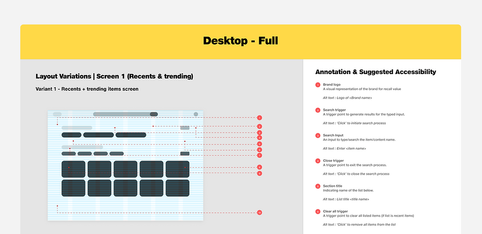
Alt text annotation for ‘Text based search variant’ on desktop device (or large window grid)
UX Acceptance Criteria (UX AC)
This document represents the final output of the UX exercise and serves as the single source of truth (UX) for the pattern. Whether it’s a visual designer refining layouts, an interaction designer shaping flows, or a backend developer aligning logic, all stakeholders reference this artifact to ensure consistency. Any future updates or refinements must be captured here, maintaining its authority as the canonical reference.
The UX Acceptance Criteria (UX AC) encapsulates the complete definition of the pattern, its purpose, scope, and boundaries (when to use and when not to use). It further outlines the flows, information architecture, anatomy, variants, and accessibility considerations, supported by guiding principles. In select cases, it also includes explicit do’s and don’ts to prevent misuse.

UX AC for ‘Image-based Search pattern’
%E2%80%99.png)
Definition for ‘Table pattern (editable type)’

Interaction notes for ‘Table pattern’
UI
The UI track was structured into four key pillars: UI exploration (cut matrix), UI exploration (collage, design, and aesthetics), UI accessibility, and finally, the UI blueprint document, which represents the consolidated output of the entire exercise.
If UX establishes the purpose, logic, and behaviour of a pattern, then UI gives it form and character, layering in aesthetics, brand expression, and visual coherence. Here, Jio’s design language came alive through the deliberate use of design system components, tokens, and micro-patterns, ensuring both consistency and distinctiveness.
As with the UX process, we’ll walk through each part at a high level, focusing on the intent and outcomes.
UI Exploration (Cut Matrix)
The cut matrix is a structured method we developed to distill insights from benchmarking. It takes every element or asset identified during desk research (as captured in the coverage matrix), aligns them with the IA elements and those documented in the UX acceptance criteria, and organises them into a comparative grid.
From here, each element follows one of three paths:
-
If it already exists in JioDS, we reference it directly as a reusable component.
-
If it exists but needs refinement, we raise an enhancement request with the DS components team while also creating a tailored version for the pattern.
-
If it’s missing entirely, we request a net-new component from the DS team, ensuring the pattern can progress seamlessly. In parallel, we also create a custom component using DS tokens to ensure the pattern can move forward without delays.
This process ensures patterns are both evidence-backed and system-aligned, bridging research findings with scalable design system assets.

Cut matrix for the input portion of trigger for ‘Voice-based’ Search pattern.
UI Exploration (Collage, Design and Aesthetics)
This stage is where the system truly comes to life. It begins with collaging, assembling the defined elements from the cut matrix, incorporating what already exists in JioDS, and designing or refining any missing or variant components. From there, we establish UI relationships through defined tokens, mapping them to the wireframe hierarchy and prioritisation to ensure coherence and scalability.
While aesthetics are at the forefront, the process goes deeper. By default, correct token usage ensures alignment with Jio’s brand DNA. Beyond that, we evaluate and refine across critical design principles: hierarchy, contrast, alignment, proximity, repetition, balance, whitespace, consistency, eye flow, visual rhythm, typography, colour schemes, and emphasis. In rare cases where taxonomies are hardcoded into patterns, we also ensure tone consistency.
The result is not just visually polished screens, but system-grounded, brand-aligned interfaces that are modular, accessible, and adaptable across diverse contexts.
%2C%20and%20relationship%20between%20el.png)
Example of selected variants for smaller components (left), and relationship between elements (right)
UI Accessibility
The accessibility review within UI focuses on two fundamentals: component legibility and colour contrast. Our benchmark is clear; no element within a pattern should fall below AA compliance as defined by WCAG 3.0 standards.
To achieve this, we rely on a combination of manual and automated checks. Tools like the Contrast Checker plugin provide semi-automated validation for contrast ratios, while Jio’s in-house themer plugin ensures multi-brand theming is accessible by default, provided that the correct tokens have been consistently applied across all components.
This step is less about box-ticking and more about ensuring inclusivity is embedded at the system level, so accessibility is not an afterthought but an inherent part of every pattern delivered.

Contrast accessibility check for elements of ‘Table’ (low emphasis variant for core Jio theme in light mode)

Contrast accessibility check for elements of ‘Search’ (desktop variant for core Jio theme in light mode)

Accessibility check for search pattern for all Jio multi-brand themes within all three modes (light, dark, bold)
UI Blueprint
The UI Blueprint serves as the definitive handoff artefact for both Figma component designers and front-end developers. It consolidates every detail of the pattern, from tokens and spacing to the full anatomy of each element, eliminating ambiguity or guesswork. This document becomes the single source of truth, ensuring design intent is carried forward into implementation with precision and consistency.
%E2%80%99%20pattern.png)
Part UI blueprint for ‘Search (text-based)’ pattern
%E2%80%99%20pattern.png)
UI blueprint for ‘Table (editable)’ pattern
Interaction
Note:
The Interaction layer was intentionally deferred to later phases, given resource constraints and the absence of dedicated expertise at the time. It has been marked as TBD for subsequent iterations, particularly when evolving complex patterns like Search and Table. That said, to avoid leaving gaps, the UI designers referenced Material Design motion tokens, embedding key motion guidelines that establish a baseline for transitions and interactions within the patterns.
Testing
The Testing phase was structured into two tracks: user testing and functional testing. At this stage, we prioritised user testing, allowing us to validate flows early, minimise downstream rework, and accelerate iteration cycles within the UI phase itself. Functional testing, on the other hand, was conducted later once components were created, with design practitioners serving as the test users to ensure fidelity and consistency in implementation. For both the ‘Search’ and ‘Table’ patterns, dedicated focus group testing was conducted by the research team. These sessions validated the design across key scenarios and confirmed usability alignment, enabling the patterns to pass through all major UI iterations without requiring significant rework.
Component Design/ Figma Design
This phase was about bringing the pattern to life through componentisation. The work went beyond visual fidelity, ensuring long-term scalability and usability. Key activities included establishing the component’s internal slot architecture, defining API and property structures to support flexibility, and finally building the pattern as reusable components. This ensured discoverability, consistency, and accessibility for every product designer across Jio. Each component then passed through an additional round of functional testing, validating that property taxonomies were clearly understood and that the components performed seamlessly across products and files with auto-theming support.
Challenges:
This phase came with its own set of challenges, primarily due to Figma’s limitations at the time. Many of our patterns were extremely heavy, often exceeding 900+ variants per component, dangerously close to Figma’s 1,000-variant cap per file. In addition, Figma’s 2GB file-size limit and the fact that it loads all variants simultaneously made performance sluggish and files difficult to manage.
To work around these constraints, we implemented a three-tier publishing strategy. Each tier progressively reduced the number of variants, making it easier to publish without hitting Figma’s breaking points, while also ensuring faster access for product teams dragging assets into their workflows. Although this was essentially a hack, the approach was complemented by the internal goal of building a plugin that could prune unnecessary layers, further streamlining performance and usability.
Another challenge surfaced in the Table pattern. The decision point was whether to publish a default 4x4 table structure (two headers, two body rows) or a single table cell. After testing, we concluded that a single cell was the more scalable approach. Why? With a 4x4 auto-layout in Figma, users could only modify either a row or a column at a time, not both simultaneously. For instance, if a designer wanted to change the colour of an entire row and a column, Figma’s constraints would have forced them to choose one, reducing flexibility and efficiency. By publishing a single table cell as the base pattern, we ensured maximum scalability, flexibility, and efficiency for product teams, while still supporting complex table structures through replication.

Component architecture for ‘Search’ pattern
Documentation and Release
This stage is one of the most critical, as it ensures that both the pattern components and all supporting documentation are centralised, discoverable, and usable across teams. The goal is to make the pattern not just a design artefact, but a fully enabled asset for the entire product ecosystem.
The deliverables at this stage include:
-
Published Pattern (Component): Added to the central JioPatterns Library, enabling designers to directly reuse and scale it across products.
-
Styleguide: A reference for business, product, design, and development teams to understand the pattern’s purpose, principles, and guardrails.
-
Journey / Stylesheet: Ready-to-use templates that product teams can copy, adapt, and embed into their workflows.
-
Demo Screens: Real-world application examples that illustrate the pattern in context.
-
UX Acceptance Criteria: A structured set of guidelines to help developers understand the underlying logic and interaction rules of the pattern.
-
UI Blueprint: A detailed handoff document equipping developers with spacing, tokens, and anatomy details to build the pattern seamlessly on the front end.
In essence, this phase transforms the pattern into a single source of truth, one that is not only consistent and reusable but also actionable across the design-to-development spectrum.
%E2%80%99%20pattern.png)
Styleguide for ‘Search (text-based)’ pattern
%E2%80%99%20pattern.png)
Journey/ Stylesheet for ‘Table (view-only)’ pattern
%E2%80%99%20pattern.png)
Demo screens for ‘Search (image-based)’ pattern
Adoption and Beyond
Building a great pattern is only half the journey; driving adoption and sustaining it is the other half. Once a pattern goes live, it needs to be marketed across Jio so teams are aware of its availability. The next step is enablement (or sales), where teams are guided on how to effectively use the pattern in their workflows. Finally, there’s ongoing support (or after-sales): a channel for addressing bugs, evolving requirements, and handling any issues that arise in real-world usage.
The adoption process and the iterations itself is a massive exercise in strategy and execution, and I’ll cover it separately as a dedicated case study. For now, I’ll share a high-level glimpse-snippets of adoption milestones.

Release note via monthly newsletter

Release note via MS teams DS community
.png)
Pattern adoption analytics data from figma (Aug 24, 25)
Most of the processes in this case study are intentionally summarized to provide a glimpse without revealing sensitive details, in accordance with confidentiality agreements. However, they still offer a holistic view of the work and impact.
The full case study is private and can be shared upon request. If you’d like to dive deeper into the evolution, insights, or behind-the-scenes stories from this project, please don’t hesitate to get in touch.
Snippets
%20and%20Relia.png)
Example of ‘Search’ and ‘Table’ pattern implementation within JioSaavn (left) and RelianceProcureNXT (right) products respectively.
Example of Table pattern's 'how to use' video (video have been cut short and audio have been muted intentionally)